The last of the big five words is chart. This section also has a number of options. We have a video on Quiz charts, and we will go over all the details in another article.
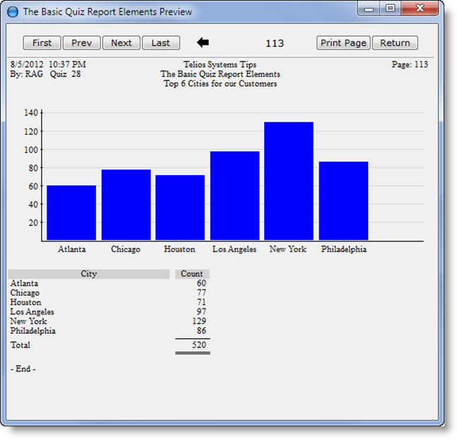
To create a chart takes just three lines on the Quiz report. For our example, we’re going to chart the number of Customers in the top 6 cities. The chart lines look like this:
- chart– introduces the chart. The argument is the y-axis.
- count on– the contents of the y-axis. In this case we are counting the number of customers by name.
- label – the name given to the y-axis (for the legend).
- using – a mask for formatting the number
- title– the title of the chart
- group– the argument forms the x-axis.
- city– the contents of the x-axis, (customer city).
- label – the name given to the x-axis (for the legend).
- limit– the number of columns. The argument is a literal.
- high– of all the cities, we want the highest values.
- legend– this will print a legend of the charted values after the chart.
- total– print a total of the number of cities in the legend.
- bar – type of chart. This can be bar, line, or pie.
- color – color of the bars or lines. The argument is the color.
The chart prints at the end of the report. This is what we get:
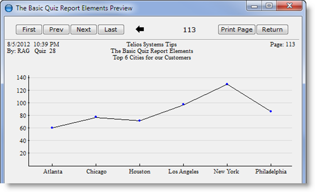
Change the bar to line and the result is this:
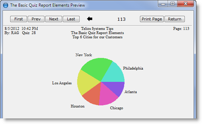
Change the bar to pie:
Or you could print all three. There is no limit to the number of charts that can be added to each report. Each chart can highlight a different view of the data contained on the report.
There you have it. The main big five words. Have fun…
 Page 1 — the basics
 Page 2 — the result
 Page 3 — the FIVE key words
 Page 4 — find
 Page 5 — where
 Page 6 — print
 Page 7 — sort
 Page 8 — chart


